

What’s the first thing you do when you’re looking for something in your city? You reach out to your smartphone > go to a search engine (mostly google) > search for a product or a service that you’re looking for.
Your potential salon clients are doing the same as well.
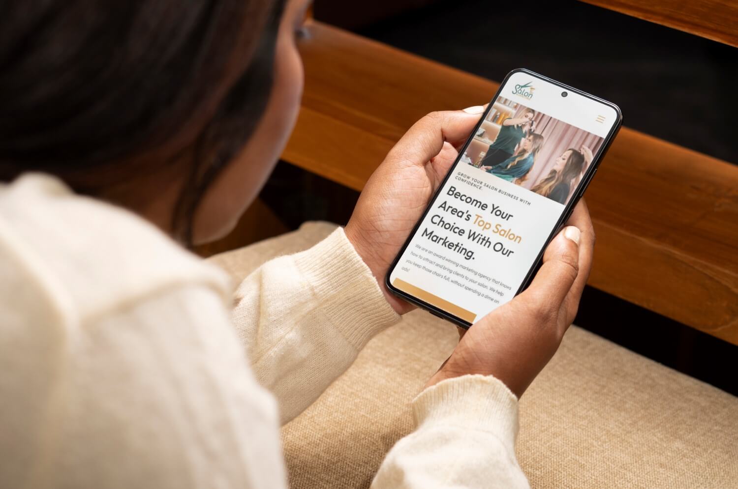
Gone are the days when people used laptops and desktops to browse the internet for their personal needs. With the internet revolution, 61.79% of all internet traffic comes from smartphones. With that being said a question needs to be asked: is your salon website smartphone ready?
In this article we’ll help you understand what a mobile-friendly or a mobile-responsive website is. We’ll also discuss the steps you can take to make your existing salon website mobile responsive, so that you can bring those smartphone users to your salon chairs.
Let’s get started!
What is Mobile Responsiveness? Why is it Important?
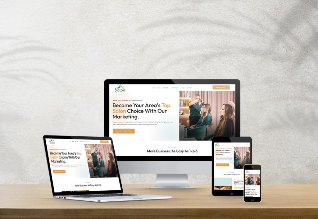
In case you haven’t heard of a mobile responsive website before, it may sound fancy or a bit overwhelming. But it has a simple meaning: your salon website should be like water, taking the shape of the vessel it is poured in. Meaning, a responsive website should automatically adjust to the screen size of the device it’s being viewed on.
It is important because your website needs to look great and function well when someone’s browsing on a mobile device. Usually, using a website builder or CMS (like WordPress with responsive themes) that supports responsive design can get the job done. In case you end up hiring web developers, make sure website responsiveness is on their priority list.
How to Create a Mobile-Friendly Website for Salons?
Below are a few steps you can take:
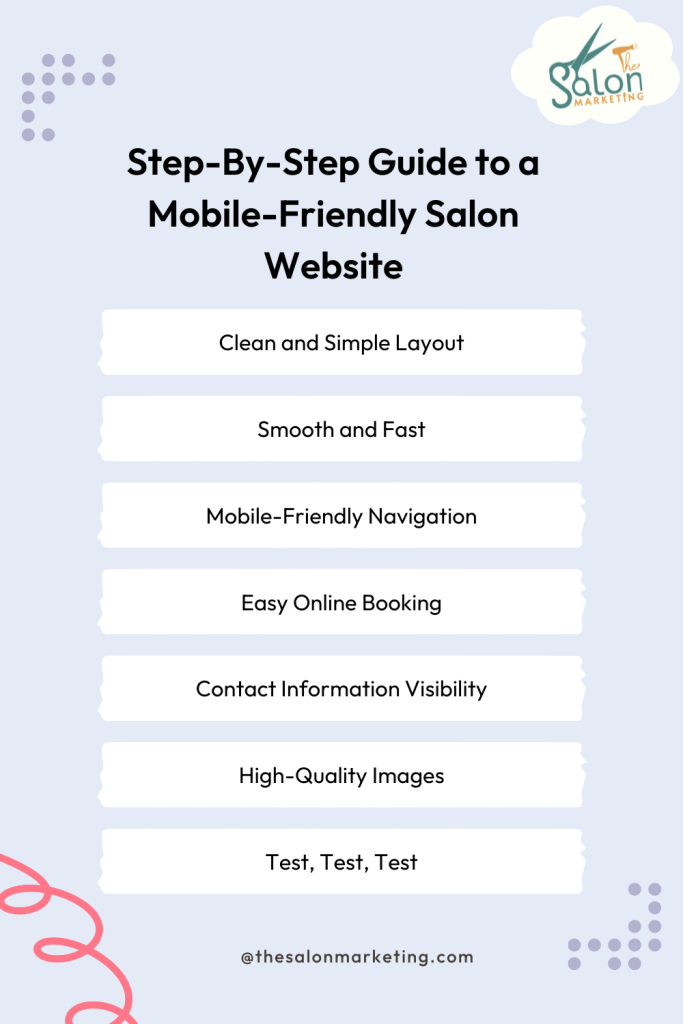
1. Clean and Simple Layout
No one loves clutter, it’s confusing, overwhelming and sometimes frustrating. Your website’s design should be simple, clean and easy to navigate. On smaller screens, an intuitive layout helps users quickly find what they need without being overwhelmed by too much information. Utilize large buttons with easily readable fonts.
2. Smooth and Fast
In this fast-paced world, most people prefer to book online so that they don’t have to wait long hours. So, don’t make them wait on your website, too. Slow websites are no fun. If your loading time is too much on mobile, the visitors are most likely to leave. Making sure that your website for salon loads quickly is like having an efficient line in your salon; customers get served quickly and leave satisfied.
A few things you (or your web developer) can do to reduce website loading time is: optimize images by compressing them (TinyPNG is a FREE tool that you can use), use browser caching, and reduce code. Tools like Google PageSpeed Insights can assist in measuring and improving load times.
3. Mobile-Friendly Navigation
Guide your visitors with easy navigation. Your hair salon website should have clear links to take the visitor all the way to booking their appointment. Menus should be easy to locate for visitors to navigate on the website, with properly spaced out buttons and links that are easy to tap. Concise wordings so they can find what they’re looking for quickly – for instance, how to book an appointment or see the latest styles. Using a familiar three-line icon (hamburger menu), and proper spacing between clickable elements to avoid accidental clicks are safe bets as well.
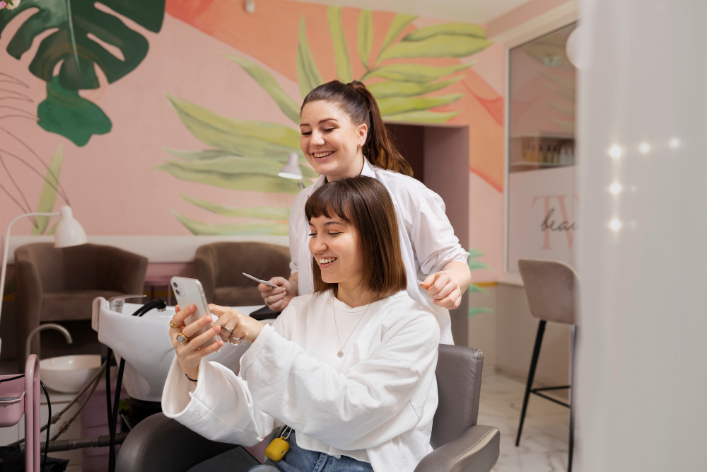
4. Easy Online Booking
Implement a streamlined process for your clients to book appointments directly from their phones. The booking process should be easy and hassle-free. Do not complicate it. Integrate an online booking system that is mobile-friendly. Make sure the booking process requires a few steps and can load quickly on mobile devices.
5. Contact Information Visibility
Your salon’s phone number, address, and social media should be prominently visible on your hair salon website. Clients should be able to contact you with a breeze. Putting all the contact information at the bottom is not a good idea. No one likes to scroll that much. Instead, have the option for a contact page on top of the website. Keep your contact info visible and clickable (e.g. phone numbers that initiate calls or addresses that open Google Maps for directions).
6. High-Quality Images
Clear, well-optimized images that showcase your salon’s work. Images help convey the quality of services, but large, unoptimized ones may slow down your website. To optimize site speed and load times for compressed high-resolution images that load quickly use formats like WebP that are optimized specifically for web usage.
7. Test, Test, Test
By regularly testing your website on different mobile devices and screen sizes, you can ensure it remains functional and user-friendly. Utilise tools such as Google’s Mobile-Friendly Test as well as manually testing it on various iOS and Android devices (to keep a safe margin).
Pro Tip :
You can also link your social media profiles and feeds. Clients would love to explore your instagram and want to read about reviews. It is easy in mobile phones to switch between apps so it won’t be a hassle for them. Social media is a power tool for salons, and as a salon owner you need to use it.
Include social media icons in the header or footer and embed an Instagram feed that showcases your latest work.
Conclusion
An appealing, mobile-friendly salon website is essential to attracting and retaining clients. By prioritizing responsive design, fast load times, user-friendly navigation, and an effortless booking process, you can provide a user-friendly experience that keeps clients coming back. Regular updates and testing of your site will ensure it keeps meeting the needs of mobile audiences.
If you have a salon and looking for someone who can help you create a mobile-friendly website, TheSalonMarketing is the right partner. Our team of experts and developers can be the right fit for your business to grow and profit.
Build a hair salon website that never stops booking new clients for your business!! Get in touch today!
Hey, I'm Anshul and I'm a 2-comma club award winner with over a decade of experience in the digital marketing industry. I specialize in helping salon and spa businesses scale their business using proven digital marketing strategies.
Throughout my career, I've had the privilege of working with a diverse range of clients, from world-renowned motivational speaker Tony Robbins to marketing guru Russell Brunson, as well as internet sensations like Julius Dein and Dan Henry.